Friday 29 April 2011

Armani Beauty Ad


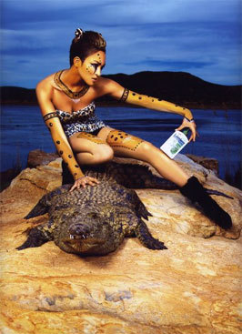
Armani have used a dark background which gives their images a dark edge that hints at sexuality rather than femininity. Similarly to the other ad campaigns the figures take up most of the frame and are bare other than the make up -as this is a beauty campaign rather than a jewelry campaign.

David Yurman Jewelry ads


I love these ad campaigns; the black and white emphasizes the contrast in the images. Again the figures take up most of the frame leaving little of the background visible, all of the backgrounds have little to no detail. Each model appears bare appart from the jewelry.

Gucci Jewelry Ad


Similarly to Dior, Gucci have used a plain dull coloured background and kept the model bare so only the skin and hair tones of the model are canvas to the jewelry. Gucci's images have a 'sex appeal' or sense of lust from the model touching her lips with both her fingers and the jewelry.

Silver -Jewelry focus -Dior Ad

Catherine Mcneil for Dior.
I think these images are so striking because of the colour contrasts and body language. A plain background helps to emphasize the figure, I like the fact the form takes up most of the page space so little of the background is visible. Having such small amount of colour in the background and the form mainly being skin and hair tone really emphasizes the jewelry.

Monday 25 April 2011

Fairy Tale Photography

This image has direct fairy tale links, it takes advantage of showing fashion as a fantasy. I feel this idea creates a huge debate- in photography fashion can be portrayed in two ways: the first is fantasy -creating an image that shows fashion as an unreachable/untouchable object that women try to aspire to but feel they can never achieve. The second is realistic/ achievable, showing the clothes in natural surroundings (realistic make up/not theatrical, backgrounds such as citys, households, everyday places, and styling being achievable by real women).


Silver Portrait

Black&White and grey scale images are not something associated with spring; but I feel this image has an innocence about it. The lighting and styling have a vintage/60's feel; including the torso instead of just the main portrait brings in more of the fashion. It works very well in this image as the top is highly detailed.


Spring -high concentrated light

This image is very light, the white and green tones suggest a clean fresh feel that is instantly recognisable with spring. I feel the close up alongside the large full figure image works really well and is very striking. I definitely feel this layout could be used in Vogue.


Overlay

Thinking about what other directions I can take my photography in I came accross this overlay image; at first I thought it used long exposure allowing the model to move, but after closer inspection you can see the main figure has been copied and pasted with high transparency.
The colours give a sense of electricity, I especially like the highly saturated pink.


Dark Wild Cats Photography


I used my research so far to do a small shoot to try out extreme make up and dark photography. I feel this image was the best of the shoot. I found it difficult as I used myself as the model (as I was unsure as to how the lighting and make up would work) and as the photographer. The images are quite blurry and I feel they are too dark for a spring/summer fashion shoot.


I am worried that dark photography may not be the route to take considering the audience -Vogue customers looking for a photo shoot on spring/summer fashions.

I also feel the theatrical make up is too far for a Vogue shoot, I think that making the make up more suitable for a beauty shot would be more appropriate and appeal to Vogue reader's.

Wednesday 20 April 2011

More dark photography


Dark photography


Here are some examples of dark lighting in photography. I think dark lighting would go well with my wild cats theme as it suggests danger which links with the animalistic idea of survival of the fittest.


The thing I am worried about with using dark lighting is that the clothes will not be as visible.

POSE


this pose really reflects what I am invisaging for the Vogue shoot, the pose is warrior-like, it shows women as confident and able while reflecting the animalistic theme

Animalistic pose


The model's pose is very animalistic, the make up is OTT with body art as well. I think that crouching creates a sense of hunting/animal

Make up


I feel this make up would be good for close up shots for accessories, hair etc but I feel it would be lost in a full body shot

Wild Cats!


One of the trends I am thinking of using in my Vogue article is Animal prints and brown earth tones, so the idea I have come up with is wild cats. I could do a location shoot in a wooded area to create a 'forest' backdrop and have the model in heavy make up or possibly face paint.


I particularly like the make up in the image above, I also like the dim lighting that creates a sense of danger.


Press Release

Here is a press release I found particularly good.
It's short and too the point but includes lots of descriptive words to grab the reader.
It says where, when and how to get tickets.

Wednesday 13 April 2011

Facial, Make up Embellishments


Paint to reflect trend colours?


S/S 2012

Trends S/S 2012 Colours: Blue, Silver, Pale pinks/purples, Earth tones Trends: Lace, Embellishments

Photography Research

2 Photographer's Ive found that i really like:

Remigiusz Kozdra

Lara Jade

Timberland Interiors -Natural, wood


Hollister Interior -Research Ralph Lauren Article


Dark, homely features, chair

Vogue article about flagship store

Link

lots of good quality images

I would love to use my own photography for this article but I am unable to travel to the flagship store to get my own images; as the article is mainly focussed on the store I want some informative images of the store in the article

Ralph Lauren Flagship Store Blog Link

Link to one of the blogs I got info about the flagship store from, good images