
Monday, 28 March 2011


Monday, 14 March 2011
Incorporating colour themese to text


I also used text wrap to create the circle shape in the paragraphs


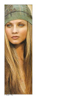
Ralph Lauren image

image from ralph lauren's a/w 2011 collection,
I think this image as my own illustration would be very striking.
More title placement
 The bottom title looks much more effective having the smaller writing tightly attached to the main title
feature title

Playing with the idea of scale and spacing to create a feature of the title, also horizontal vs vertical

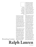
My article in initial layout

 i used a photo insted of a large quote as I found the shape of the box was not suitable for large font. I think the image works well in the replacement of text.
I think this layout overall has turned out well; altering the fonts is my next step.
My article in long layout


This is how my article for Drapers fits into one of my layouts; I have also used an image from the internet as a representation of how my authors info will look. For this image I am going to create my own illustration.
I am very pleased with how my written article has fitted into my layout.
altered layout


The image is smaller so it now lines up with altered author info.
Author info is now on top of both text collumns rather than only one; I prefered it over a single collumn.
Another layout idea


I have created another layout idea that incorporates both pages of the spread. I do not feel it is as effect as my last two layout ideas. But it does have a good use of space.
Image insert
 I have inserted a 'Ralph Lauren' image for a better understanding of the layout; when it comes to images I shall use my own.
Black box =image placement


The black box represents an image, I have altered the author text to type from the right of the box; I feel the overall layout works well and has a good sense of space. I especially like the title placement.
One page for text, opposite for image

 Having the title at the bottom of the page looks very striking.
I prefer the author info on the right hand side but the text needs to be from the right of the text box rather than the left.
New title structure


The structure of this title is much more balanced and fits better with the text; i feel having the space over the aurther info really helps the structure of the layout.
BIG title


title now covers both pages which I think is an effective use of a double page spread. the only concern I have is that the text it unbalanced, Ralph Lauren is shorter than Branding Genius; I am going to swap the title around and see if I can line Ralph Lauren up with the aurther info.
shortened text grids


I have shortened the text grids so that there is more space at the top of the pages, either for images or to be left blank. i have also made the second page text in line with the first page text rather than the title.
Long Title

I feel this title works best, it is clear large and effective. I have moved the auther info down to create space and lines it up with the text grids; although in this image the left hand column looks longer than the two text collumns they are in correct lines to one another. I am now thinking that making the text grids shorter to give the page more space and a larger image is my next step.
Title exploration
 I returned to the idea of having the title on seperate lines, I increaded the font size and changed 'Ralph Lauren' to bold to help it stand out. i am not happy with having the title seperated but without this seperation i am unable to use the larger font size. I am going to move the author info down and allow the title to expand.
Single line

Having it on a single line is a lot clearer than having the line break but i feel the title could be larger to have more of an impact.
Title allinement

i have made both parts of the title line up with their grids but I do not like how they are not on the same line, initially having them on seperate lines but overlapping worked well but I think they need to be overlapped to justify using seperate lines.
Including Ralph Lauren Title


I have kept the second page the same but this time I have included the Ralph Lauren title for Drapers, I lined it up with the author info on the left hand side. I am unhappy that the word 'Ralph' does not line up with the second text grid.
InDesign grids -my first go!
 Above is the 2nd page of the 2 page spread and below is the first.
 I have left the top halves of the pages and will explore adding pictures/titles. you can see on the first (featured directly above) I have included on the left hand side a square box for the aurther's photo and small description about them below. I have also used the previous tutorial to add page numbers, the magazine name and date.
The second page holds two grids and a smaller grid for a large quotation, I have used this to keep it cohesive with the first page layout.
YouTube - Designing Magazines: Step 1
YouTube - Designing Magazines: Step 1
youtube tutorial about creating magazine layouts and a master page -including page numbers
youtube tutorial about creating magazine layouts and a master page -including page numbers
Sunday, 13 March 2011
More Business Cards
 The reflecting of the curved logo in the font and curved corners is the selling point of this design; I need to look more indepth at how I can make my logo and business card cohesive, as well as keeping any possible leaflets or adverts cohesive.
 I think the use of colour on this business card is it's main feature. Using black, white and one accentuating colour is very striking; I personally would prefer to see white more prominant than the black. In my illustration lessons I have also discovered that my prefered pallette is monochrome with small hints of a single colour; using this colour theme would look very striking on my business card and reflect my simple, clean aesthetic.
I think the use of words to create an overall theme and add colour is great; using words would be very appropraite for my business cards as fashion journalism is the sector I am interested in. Using words also means that people get a better understanding of you/your business.
Magazine Layout -Space

I think the balance of space, text and image in this magazine layout work perfectly and is a good starting point for my magazine layouts. Space is a key aspect I want to focus on in my layouts.
Subscribe to:
Comments (Atom)