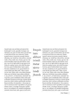
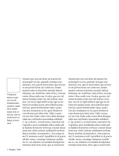
 Above is the 2nd page of the 2 page spread and below is the first.
 I have left the top halves of the pages and will explore adding pictures/titles. you can see on the first (featured directly above) I have included on the left hand side a square box for the aurther's photo and small description about them below. I have also used the previous tutorial to add page numbers, the magazine name and date.
The second page holds two grids and a smaller grid for a large quotation, I have used this to keep it cohesive with the first page layout.
No comments:
Post a Comment