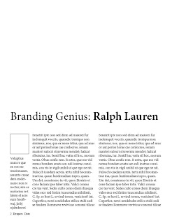
I feel this title works best, it is clear large and effective. I have moved the auther info down to create space and lines it up with the text grids; although in this image the left hand column looks longer than the two text collumns they are in correct lines to one another. I am now thinking that making the text grids shorter to give the page more space and a larger image is my next step.
No comments:
Post a Comment