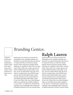
 I returned to the idea of having the title on seperate lines, I increaded the font size and changed 'Ralph Lauren' to bold to help it stand out. i am not happy with having the title seperated but without this seperation i am unable to use the larger font size. I am going to move the author info down and allow the title to expand.
No comments:
Post a Comment